Production: Independent film studios Look back at the five films you have analysed for your existing product research. Find which studios made them – e.g. Film Four, Studio Canal, BFI, BBC Films etc.
Se7en - New Line Cinema
Kill Bill - Miramax Films
Donnie Darko - Pandora Cinema, Newmarket Films
Little Miss Sunshine - Fox Searchlight Pictures
What other films do these studios produce? Can you find any any other independent, arthouse or low-budget examples?
New Line Cinema:
-'The Texas Chainsaw Massacre' (1974)
-'A Nightmare on Elm Street' (1984)
-The 'Final Destination' franchise (2000-2011)
-'The Conjuring' + 'Annabelle' (2013 + 2014)
Miramax Films:
-'Reservoir Dogs' (1992)
-'Three Colours: Blue' (1993)
-'Pulp Fiction' (1994)
-'Trainspotting' (1996)
-'Amelie' (2001)
-'City of God' (2002)
-'No Country for Old Men' (2007)
Newmarket Films:
-'The Usual Suspects' (1995)
-'Cruel Intentions' (1999)
-'Memento' (2000)
Fox Searchlight Pictures:
-'Waking Ned' (1998)
-'One Hour Photo' (2002)
-'28 Days Later' (2003)
-'Napolean Dynamite' (2004)
-'Confetti' (2006)
-'Juno' (2007)
-'Slumdog Millionaire' (2008)
-'Black Swan' (2010)
-'The Grand Budapest Hotel' (2014)
-'Brooklyn' (2015)
-'Me, Earl and the Dying Girl' (2015)
Do the studios have any notable successes? What is the most successful low-budget or independent film the studio has released?
These studios do have notable successes. A good example is that it's clear that Little Miss Sunshine of Fox Searchlight Pictures was extremely successful in that its budget was just $8 million and yet it managed to make a profit of $100.5 million.
Distribution: Independent film distributors
Now research the distributors for each of the arthouse films you have analysed for your existing product research. Who distributed each film in the UK?
Se7en - David Fincher (1995) - Entertainment Film Distributors
Kill Bill - Quentin Tarantino (2003) - Buena Vista International
Donnie Darko - Richard Kelly (2001) - Metrodome Distribution
Little Miss Sunshine - Jonathan Dayton, Valerie Faris (2006) - Twentieth Century Fox Film Company
How many cinemas did each film open in?
Se7en - According to Wikipedia, it was released in the US on 22nd September 1995 in 2,441 cinemas where it grossed $13.9 million on its opening weekend.
Kill Bill - According to Wikipedia, it was released in both the US and Canada on 10th October 2003 in 3,102 cinemas, grossing $22 million on its opening weekend.
Donnie Darko - Interestingly, during its first weekend, it was only screened in 58 cinemas in the US, earning just $110,494. It is speculated that this may have resulted from the fact that the film was released shortly after the 9/11 attacks.
Little Miss Sunshine - Upon initial release, it was only released in seven cinemas in the US, earning an impressive $498,796. The largest number of US cinemas it appeared in was 1,602.
How much money did each film make? Did it make a profit against the budget?
Curzon Artificial Eye is a British film distributor that specialises in arthouse, foreign and independent films.
Look at the Curzon Artficial Eye YouTube channel. Watch three trailers for recent or upcoming independent films and identify something you can learn from each film to use in your own film production.
In this trailer for 'The Unknown Girl' I liked the use of withholding information from the audience, for example, we never actually see the dead girl who is being talked about throughout the trailer, despite the main character Jenny showing numerous people pictures of her, and more specifically, a moment towards the end of the trailer when we see a car pull in front of the main character's car and hear it crash but we aren't shown anything else.
From this trailer for 'After Love', I could try and incorporate a variety of camera angles in my production to try and communicate the mood of a scene just like we see in the trailer. For example, during the brief scene when the main female character has friends over for dinner, she is in none of the same shots as her husband which could emphasise their romantic separation so maybe this is something I could try and replicate in my own work.
For me personally, I love how in film, non-diegetic music can combine with editing to create the desired atmosphere and I think this trailer for 'The Handmaiden' does that very effectively, especially towards the end when the pace of the editing begins to quicken and the music reaches a dramatic crescendo. I think with certain scenes from my production in mind, I could use this same strategy to create tension and other feelings throughout the film.
Exhibition: Arthouse cinemas
Find some London-based arthouse cinemas and research the following:
What is the name of the cinema? Where is it?
I researched the Electric Cinema which is located on Portobello Road in Notting Hill.
What type of films do they show? What films are on this week? How do their programmes differ from the major cinema chains like Vue?
At the moment, 'Guardians of the Galaxy Vol. 2' is being shown every day until the 11th May. This doesn't differ hugely from the films that are most likely currently being shown at major cinema chains but there are films being shown over the next few weeks that aren't currently being shown at mainstream cinemas e.g. 'Rules Don't Apply' and 'The Levelling'.
What type of audience attends this kind of arthouse cinemas? Are there any clues on the website regarding the target audience? How can you tell?
I think that the vast majority of an arthouse cinema audience would definitely be people who have an avid interest and appreciation for arthouse film and art in general and enjoy watching independent, niche films. Something that could be an indicator of this on the Electric Cinema website is that where it advertises the screenings of the conventionally arthouse films, most of them appear to only be available to members which could imply that they know that the people that are going to be members are the people that have a genuine interest in the arthouse genre.
A case study in independent film production: Film London and Microwave Film
Film London is London's film and media agency. Its aims are to: grow the film industry in London, ensure the film culture in London is maintained and use film to promote the city of London to the world.
Microwave Film funds the films made by Film London but as well as that, it aims to provide mentoring support to all of the shortlisted upcoming projects, and then providing financial aid once the projects have been distributed.
What is the London Calling project for Film London and how does it encourage independent filmmaking?
London Calling is Film London's annual short film scheme which supports and helps London's most budding filmmakers reach their full filmmaking potential while providing financial support and professional training and mentoring.
1) Research the BBFC: what is the institution responsible for? How is it funded? What link does it have to government? The British Board of Film Classifications (BBFC) is an independent company that allocates age ratings to films before being released in the UK. According to the BBFC official website it is a "non-governmental body" that gets its income "solely from the from the fees it charges for its services" which is based on the running time of the films they release. 2) Read this BBFC guide to how films are rated. Summarise the process in 50 words. One of the main things that the BBFC do is analyse the films they are rating just to see what the narrative is/who the characters are and how frequent things like strong language, violence, sex/nudity, drugs, threat are in the film and at what points they occur during the film. Sometimes, film content can be deemed too inappropriate for the BBFC to assign a rating so they are sent to the distributors who ultimately have final say over whether the film is released or not. 3) Read this BBFC outline of the issues faced when classifying a film. Summarise the debate in 50 words. The main argument had in the classifying process is whether films should have the freedom to include whatever content they want (provided it stays within the law) without worrying about what age group it should be limited to or whether by doing that, they risk damaging the "moral development" of young children if they happen to be exposed to it. 4) Read this BBFC section on controversial decisions. Why did The Dark Knight generate a large amount of media coverage regarding its certificate? Do you agree with the 12A certificate The Dark Knight was awarded? The main reason The Dark Knight generated a large amount of media coverage was that a large proportion of the public deemed a 12A certificate to be too low a rating due to the amount of violence that features in the film and parents were worried that it could be too distressing for 12-14 year olds to watch. However, an argument against this that I personally agree with is that despite hundreds of complaints from members of the public, examiners said that all the violence in The Dark Knight adheres to the BBFC Guidelines for a 12A rating which states that "violence must not dwell on detail. There should be no emphasis on injuries or blood". 5) What are the guidelines for a 15 certificate? Discrimination: A film with a 15 certificate may make reference to homophobic, racist or other discriminatory themes/language, however it should not encourage or support such behaviour. Drugs: There may be some reference to or display of drug-taking but similarly to discrimination it should never promote or advocate drug misuse. Imitable behaviour: Any 15 rated film that exhibits any type of imitable behaviour e.g. suicide, self-harm should not (according to the BBFC website) "dwell on detail which could be copied", in simpler terms, they should not show any details of the behaviour that could make copying it easier. Language: Generally, very strong language is permitted in a 15 rated film, depending on the context in which it is used. In order to determine whether a film should receive a 15 certificate, the BBFC usually consider the frequency of strong language, the people using it and the manner it is used in. Nudity: In a film with a 15 certificate, there are generally no restrictions on nudity if the context is non-sexual. They may permit some nudity in a sexual context, provided they don't exhibit it in great detail. Sex: Similarly to nudity, sexual behaviour can be shown but without strong detail. However, any references to sex in the film may be much stronger than the activity itself but any references that are deemed too strong will probably be unacceptable. 6) The BBFC website offers an explanation of every classification it makes and detailed case studies on selected titles. Choose one 15-rated film from the BBFC case studies section and summarise the classification the film was given and why. Some could argue that Hot Fuzz's 15 certificate was the wrong decision due to the fact that the BBFC's guidelines state that "there should be no emphasis on injuries or blood", yet there are several moments in the film that go against that guideline. However, the BBFC argue that because these moments are usually accompanied by humorous dialogue, it essentially prevents the distressing atmosphere that would have existed, were the violence not comically exaggerated. Therefore they felt it was not necessary to raise the certificate to anything higher than a 15. As well as this, the BBFC website mentions that Hot Fuzz incorporates two uses of what could be considered the strongest language, which ordinarily would immediately assign an 18 certificate to a film. However, similarly to the violence in the film, the two uses of this particular word are seen in quite laid back, humorous situations and neither use is with malicious intent. One could also argue that the second usage of the word could have more positive than negative effects as the character that uses it is using it to express his disapproval of drug-dealing. The BBFC concluded that due to the fact that the film is generally funny throughout and incorporates this humour to accompany the elements that individually would warrant an 18 certificate, that leaving it as a 15 was the right decision.
Title and tagline: Out of Mind Topic from brief (e.g. Modern-noir, Urban Life etc.): The Secret Genre (and sub-genre if applicable): Mystery, psychological thriller, science fiction Logline – one sentence that sums up the film and hooks people in (25 words or fewer): Imagine waking up one day to discover you are no longer a memory of the people you loved. Meet Natalie. Other successful films that are similar to yours: The Bourne Identity, The Vow, 28 Days Later Narrative structure for full 30-minute film – what happens and in what order (max 100 words): After being involved in a serious car accident resulting in her being in a coma, Natalie wakes up to discover that everyone she knows has forgotten her. She is first made aware of this when she goes home and her father denies having any memory of her. Distressed and confused she spends the night in a park where she sees her two best friends who also deny ever knowing her. She is then approached by a young man who claims to know who she is and that he is the same as her. They form a close friendship and he introduces her to other people who appear to have experienced the same thing as Natalie. The remainder of the film consists of the two of them becoming closer in their friendship until right at the end where they are both involved in an accident together, causing them to forget each other. Main protagonist, their desires, the conflicts they encounter etc.: Our main protagonist is Natalie and once she's realised she's been forgotten her desire is to find out why. Other characters and their role/audience appeal: Demi & Tim - Natalie's best friends who we see deny ever knowing her. Moses - A stranger who is ironically the only person who knows who Natalie is. Natalie's father - he also denies ever seeing her before in his life. Target audience for your film (age, gender, social class, interests etc.): Age - 15 - 25 Gender - 60:40 female to male ratio. Social class - Variety of social classes.
Ethnicity - Variety of ethnicities.
Interests - Thrill-seekers, films of similar genres e.g. The Bourne Identity.
The three-minute extract you will make and where it would appear in the film: We'll be creating the opening three minutes. It'll be from the moment when Natalie wakes up in hospital to when Moses claims to know who she is and why she has gone through what she has.
This is one of the final scenes from the 1995 neo-noir thriller 'Se7en' starring Kevin Spacey, Brad Pitt and Morgan Freeman. The significance of this scene is that it reveals who the last two victims of John Doe's serial killing spree are but through the combination of editing and sound in the first two minutes, it does so in a very implicit and subtle way.
We first see Somerset cutting open a box that Doe has sent, while Mills is standing alone with Doe in the near distance. As Somerset pulls back the first bits of cardboard he sees blood underneath and says "that's blood". The next shot is of Mills watching Somerset but he is too far away to be able to distinguish what is happening. This combination of editing and sound creates tension because we are aware that there is blood on the box so we are now dreading to find out what is actually in it. We are also reminded that Mills is on his own with Doe who has sent this box so we know that Doe, although detained, is still dangerous so now we begin to fear for Mills' safety. Somerset then opens the box completely and reels back in shock, gasping as he does so. He doesn't stop looking at its contents so we as the audience expect to also be shown but we aren't and this really builds up the tension felt because we know that whatever is in the box has greatly disturbed Somerset but the director clearly doesn't want us to know what it is so we are left gripped, wondering what's in it and how it's going to affect the remaining narrative. At first the only sound we hear while this is going on is diegetic which makes it all the more tense and real for us and immerses us in the narrative. Then, Somerset looks back at Mills and Doe and this is when the dramatic non-diegetic music begins which indicates the severity of the situation and tells us that the contents of the box could be the twist in the narrative. It also challenges our previous assumptions that just because Doe's been arrested he's unable to do any more damage.
From when Somerset says "John Doe has the upper hand" at 1:02 to when he reaches Mills and Doe at 2:02 we hear two different things happening simultaneously that are both significant. We hear Somerset shouting at Mills telling him repeatedly to put his gun down and we also hear Doe talking to Mills about what he did when he went to his house. The contrast in tone and emotion between Somerset's and Doe's voices fundamentally shows us that John Doe is in control of the situation and almost in control of Somerset and Mills. The fact that both Somerset and Doe are talking to Mills then gives us an idea that the thing in the box has a connection to Mills.
The editing during this minute also conveys the same idea because it cuts slowly from each character but with the most attention on Mills. The fact that it cuts from Doe talking to Somerset running and shouting at Mills to put his gun down could be an indication that, based on what he has seen in the box, he knows that Doe is saying things that will anger Mills to the point where he could potentially shoot him so this leaves the audience even more desperate to know what was in the box.
The dramatic music that starts when Somerset realises what Doe has done continues throughout the rest of the clip and changes in intensity according to what is said by Doe. For example, when he reveals that Mills' wife was pregnant and then laughs and says ''he didn't know'', the music reaches its crescendo and this could be symbolic of the fact that this is the thing that will push Mills too far and essentially cause him to shoot Doe.
In terms of the mise-en-scene, specifically the setting, it's all quite remote and barren and desolate which could emphasise Somerset's and particularly Mills' vulnerability and inferiority especially when the truth is revealed and it could suggest that there's nothing there by way of props or other actors to protect Mills from the truth of what's happened. Their exposure and vulnerability could also be highlighted by the high key lighting used throughout the clip. In terms of the audience and how this affects them, it ensures that their attention is solely on the actors, the box, its contents and the consequences it instigates.
The camerawork in this scene is also successful in reinforcing the tension and realism, especially when Somerset is running back to Mills, at which point the camera is handheld so it allows the audience to feel the panic that Somerset is feeling and their attention is retained. Also at the end of the clip when Mills shoots Doe a further five times the camera is at a low angle looking up at Mills which emphasises the power he has taken away from Doe.
The BBFC age rating for this film is 18 and its reasoning for this age rating is that it contains: strong bloody violence, horror and threat.
Personally I think that the film's target audience is largely male, possibly 70% male, 30% female because it does have at least one significant female character in its narrative but most of its content and subject matter I think would most likely appeal to men more than women. Bearing in mind its BBFC rating I think that it is a film more suited to adult viewers but considering that this rating was decided over 20 years ago and also the amount of young people becoming 'desensitised' to violence in film over the years I think that today's target audience for this film would be approximately 15-40. I also think people are more likely to watch this film if they are fans of its director's previous work like 'Fight Club' and 'Zodiac'; films with similar narratives and some of the same actors e.g. Brad Pitt.
This clip is from the 2003 action crime thriller 'Kill Bill' starring Uma Thurman and this scene shows us the violent meeting between The Bride and Vernita Green, the first of the five members of the Deadly Viper Assassination Squad that she comes back to kill.
One of the first things that happens in this clip is a flashback which begins with a punch and dramatic high pitched music so both things immediately grab the audience's attention and from then on, the editing is extremely fast paced which retains the audience's attention and keeps them transfixed throughout the whole clip.
Another noticeable aspect of this clip is the sound - especially the dramatic action sounds e.g. the punches, kicks, shouts of pain, the impact of their bodies hitting the walls/floor and this along with the fact that there is no more music in the background or other non-diegetic sounds after the flashback creates a strong sense of realism and essentially makes us more able to feel the pain they're feeling. However, to make the violence easier for the audience to handle, a lot of the punches/kicks sound quite animated in the sense that they sound quite similar to those that would feature in a gentler animated action sequence which is quite a contrast to Tarantino's typically graphic, raw style of film-making, subtly illustrating his versatility and originality as a director.
Something else that adds to the realism in this clip is the mise-en-scene, specifically the props and the setting. The setting is a suburban house in America and not a typical location for a fight to take place and the weapons that they use (with the exception of the gun and the knife) are all household objects which shows that neither of them are particularly prepared for a fight and the fact that both of them are getting hurt and showing the pain that they're in makes it all the more realistic for us to witness.
In terms of cinematography, focusing especially on the end of the clip when Vernita's daughter comes home from school, we are given a wide shot of the two women standing in front of the window pointing knives at each other and through the window we see her daughter get off the school bus and walking up the garden path. This essentially shows us the massive juxtaposition between corruption and innocence and creates a strong sense of tension because we know what she's about to walk into and see in her home. This tension is further emphasised by the decreased pace of editing as Vernita and The Bride stare at each other, Vernita with an expression that is almost begging The Bride to not do anything that could potentially jeopardise her daughter's innocence.
The BBFC's age rating of this film is an 18 and their justification for this is that it contains: frequent, strong, bloody violence and very strong language.
I think that in terms of gender, considering the number of alternative representations of women in this film, the split between the male and female target audience could possibly be 50/50, especially since the title 'Kill Bill' is The Bride's ultimate aim throughout the film so this is a great example of female determination which could be one of the main aspects of this film that attracts a larger female audience. Similarly to Se7en, I think that despite the BBFC age rating, this generation of young people have become desensitised to the things that feature in a lot of 18 rated films so I think the age range would be around 15-45. I also think that since Tarantino's work is quite an acquired taste, the people most likely to watch Kill Bill will already be fans of his other films e.g. Pulp Fiction, Inglorious Basterds, Reservoir Dogs etc.
This clip is from the 2001 sci-fi thriller Donnie Darko starring Jake Gyllenhaal as the eponymous character. This scene is when we first see Donnie's imaginary friend Frank's real face underneath his scary rabbit mask.
The scene begins with Donnie and his girlfriend Gretchen (played by Jena Malone) sitting alone in a cinema watching a film. This small number of characters in a place that would ordinarily be host to a great deal more characters is a very unusual scenario and an example of mise-en-scene that makes the teens appear exposed and vulnerable, subsequently making the audience wary as to whether something significant is going to take place. This unnerving, eerie feel is further emphasised by the low key lighting used throughout the scene, with the only on-screen light coming from the cinema screen. This also creates a sense of realism so before anything even happens, we're already immersed in the scene.
In regards to the editing, there is a brief moment when Donnie looks to his left at the seat next to Gretchen's and smiles - this immediately evokes fear in us because as far as we know, the cinema is empty so we have no idea who or what he is smiling at until the next shot which is Frank but this slower-paced editing is a good way of letting an audience's imagination run wild as to what the next shot is going to be, if it is shown at all. The pace of editing is generally slow as the scene progresses which contributes to the high levels of tension and fear already present, especially with the shots of Frank as he takes his mask off and looks in the direction of the camera very slowly. The alternating shots between Frank and Donnie with very minimal dialogue makes it a very intense scene because we're constantly anticipating that something will happen.
In terms of the cinematography, most of the shots in this clip are close ups of either Donnie or Frank with different reasons for each character. For Donnie it is so the audience can see his mental state exhibited by his change in facial expressions e.g. he'll go from smiling eerily to frowning in a matter of seconds, something that is best captured by a close up shot. For Frank it is partly so the audience can get a first glimpse at his wounded eye which instantly makes us wonder how it happened, particularly when Donnie asks him the same question but he doesn't answer. If a different shot was used I don't think it would have had the desired effect which would have been to shock and disturb the audience and make them feel as uncomfortable as possible.
Its BBFC age rating is a 15 due to: strong language and horror. I agree with this rating because there aren't really any elements to this film that suggest the need for it to be any higher but the language in it is frequently strong which I think is what sets the minimum age at 15, plus there are also a few scenes that younger viewers could find distressing to watch. Furthermore the plot is extremely complicated that ends in a very indirect and vague way and I think anyone younger than 15 would struggle to follow it so I think the range would be around 15-40. I think the gender balance in its target audience would be quite equal but I think the genre of it maybe pushes the male proportion slightly higher to around 55% leaving the female proportion at 45%.
This clip is from the 2006 drama-comedy road film Little Miss Sunshine starring Greg Kinnear, Steve Carell, Toni Colette and Alan Arkin. In this clip we see Steve Carell's character, Frank trying to explain to his seven year old niece Olive (Abigail Breslin) why he recently attempted suicide.
I think what's most noticeable about this clip is how successfully the dialogue conveys the instability of the relationships between certain characters. For example as soon as Olive asks Frank why he wanted to kill himself, her father tells Frank not to answer the question which causes Olive's mother to shout back at her husband and in just 20 seconds we already have a clear idea of how this family functions. Similarly to Kill Bill, the director's choice to use only diegetic sound creates a strong sense of realism and allows the audience to become more engaged in the conversation and its distressing subject matter. There are also some elements of humour in this clip, specifically at 1:31 when Olive's grandfather loudly blows his nose right in the middle of Frank's story and I think the aim of this was to alleviate the depressing feeling that Frank's suicide may have started to have on the audience. Also, when Olive describes Frank's gay relationship as 'silly' it almost forces us to laugh because it highlights just how innocent and naive she is in this situation and this family.
In terms of the mise-en-scene, specifically costume and props, we are able to get some sort of idea of their values as a family and possibly their financial situation. We can see that they are eating take-away fried chicken from a brand that probably isn't as well known to the audience as something like KFC would be; they are eating it off of paper plates and drinking Sprite from plastic cups and this in its entirety could suggest frugality. This could further be suggested by the costume, especially Olive's. The most prominent aspect of her costume is definitely her large, thick glasses which suggests that as a family, they're functional rather than materialistic. She also appears to be wearing jewellery on her arms and fingers which could indicate her attempt to look older and more grown up but the fact that all her jewellery is plastic illustrates that she has to make do with what the little money they have can afford.
There isn't anything that noticeable about the cinematography but the one thing I notice is that there are only four long shots of the whole family together, most of which are near the beginning of the clip and then as the clip goes on, the rest of the shots are either of each person individually or of two or three people together which could be an indication of the unstable, broken relationships between some of the members of the family and how this conversation itself is putting strain on their already fragile relationships.
The BBFC age rating for Little Miss Sunshine is 15 because of: strong language and drug use. I agree completely with this rating because the context of some of the strong language that features in it would, in my opinion, be unsuitable for anyone younger than 15 and also, the drug use that features in it results in death which could be upsetting for people under 15. Some people could argue that the drug use would warrant a higher rating because of the potential risk of younger people seeing it and feeling compelled to do the same thing but I myself would also set the age rating at 15 because although the drug use is frequent, I believe it's important to educate young people of the risks and dangers it poses so I think exposing them to a film in which casual drug use results in unexpected death could essentially deter them from doing the same, a message which the film's producers could have been subtly trying to convey themselves.
You now need to write up your own group's recording in a blog post - note this write-up is an INDIVIDUAL task. The blog post should include the following:
A brief introduction to what the focus group involved
A list of key quotes from the focus group recording (you don't need to identify who said each quote and using bullet points is fine)
What you learned from the discussion and how this will impact on your final product. Particularly important is any changes you plan to make as a result of audience feedback.
A detailed breakdown of the target audience for your film now you have completed some audience research: gender, age, social class, education/employment, race/ethnicity, psychographics etc.
The focus group was a session that took place during a lesson in which every group pitched their production idea to the rest of the class. After pitching our idea, we received feedback from both our peers and our teacher - examples of which are below:
"Where and how are you planning to film the car crash?"
"What would the lighting be like?"
"Would most of the 3 minutes be flashbacks?"
"Would it be better making the opening 3 minutes instead of the ending 3 minutes?
"If you make the last 3 minutes how will you communicate the main character's story?"
"Do we think you'll be able to fit all of the scenes in 3 minutes?"
"Do you want to make the first, middle or last 3 minutes?"
From this discussion, we realised as a group that some of what we had planned might not have been entirely realistic e.g. filming a car crash and it would be almost impossible to film something like that successfully. We therefore decided to only use the sound effects of a car crash over the top of various external shots of a hospital to show that the 'car crash' that's being heard has left our protagonist in hospital. We also decided that filming the final three minutes of the film (which we wanted to be flashbacks of the protagonist's life) might make it difficult for the audience to understand what's happened in order for these flashbacks to occur. So we decided to film the opening three minutes, a sequence which clearly explains what happens to our protagonist and captures her immediate reaction more effectively than the final three minutes would. Target Audience As a group we found it surprisingly difficult to establish a target audience but we were fairly certain that the ages of our target audience would range from 15-25 - firstly because the brief suggested that our film should have the BBFC rating of 15 - but also due to the fact that the issues portrayed in the narrative would be most relatable to people of that age group and all characters bar one fall into that age group. In terms of gender, we thought that there would be a 60:40 female to male ratio. Due to the fact that our protagonist is female and the film revolves heavily around her life, the film would most likely attract a female dominated audience. However, despite the protagonist being female, there are in fact more male characters than female, and our narrative could easily fall into the genre of science fiction, a genre that is usually most appealing to males. Therefore, we thought that although our film would attract more females than males, we suspected that there wouldn't necessarily be a large difference in the numbers. We think that in terms of race/ethnicity our film would appeal to a wide variety of people simply because our characters are of different ethnicities and it's a story that could happen to anyone of any ethnicity. Similarly to class, anyone of any class can and probably has experienced loss or the feelings that come with what is portrayed in our film and this ultimately was our aim - to make the film available to all ethnicities and social classes and ensure that no one's race/ethnicity or class would determine their ability to relate to or understand the narrative. I think in terms of psychographics, the group that our target audience would fit into would be 'Explorers' because as a group they enjoy 'experience', 'sensation', 'indulgence' and they are 'the first to try new brands' so these traits lend themselves to Arthouse cinema in that the people that are most likely to go and watch an Arthouse film are people that are open to new and unconventional experiences, people like the psychographic group 'Explorers'.
1) Key conventions. Look over the magazine cover key conventions notes sheet and ensure you can confidently identify the key aspects that are found on a magazine cover.
Key conventions of a magazine cover:
-Title of publication
-Slogan
-Central image
-'Flash'/Cover Line/Sell Line
-Free offer
-Colour scheme
-Name Checks
-Language
-Competitions
-Direct Address & Asking Questions
-Bar code, Date and Price
-The 'Real' Target Audience
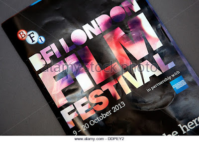
2) Write an analysis of this BFI Film Festival programme front cover. How many of the 12 key conventions of magazine covers can you see? In what way does this print product differ from a traditional magazine cover? How have the designers made this programme visually interesting?
It's clear from looking at this programme cover that not all
12 key conventions of a magazine cover feature on it but the ones I can see
are: Title of publication, central image, colour scheme, name checks, concise
language and its date of issue. I think this cover differs from a traditional
magazine cover in that there's not much information as to its contents like a
traditional magazine e.g. 'Empire' would. I think the intentions behind this
were to draw the buyer's attention to one thing only - in this case the vibrant
title/central image on a black background. To make this visually interesting,
the designers have merged the title and the central image together to make one
image instead of having them separately and I think it's this that makes it
stand out against other magazine covers and intrigue consumers. In terms of the
colour scheme, the most prominent colours (apart from black) are red and purple
which are both - especially red - quite eye-catching colours and the fact that
they appear on the cover in quite a random, abstract way makes it all the more
fascinating because most magazines have relatively well structured covers so
once this (apparently) disorganised distribution of colour has got the consumer
interested they are likely to study it more, only to discover that the colours
aren't just randomly distributed; they in fact make up a person's face - the
cover's central image. Then, after becoming interested by the cover, they'll
undoubtedly notice the lack of information about the magazine's content which
will force them to open it and read what's inside.
3) Find at least 5 arts centre or cinema programmes/brochures aimed at a similar target audience to your project (arthouse cinema). For each one, pick out one design idea that you could use in your own print work. One design element of this brochure that I could incorporate in my own work is having one photo from my photoshoot as the background so the audience get an idea of the genre and possibly the narrative of the film before seeing it.
One design idea of this programme I could use is the brightly coloured text on top of a dark background to draw the audience's attention to it.
From this brochure, I could use shapes as text boxes, particularly shapes with sharp edges or corners to make the brochure appear more attractive and unique.
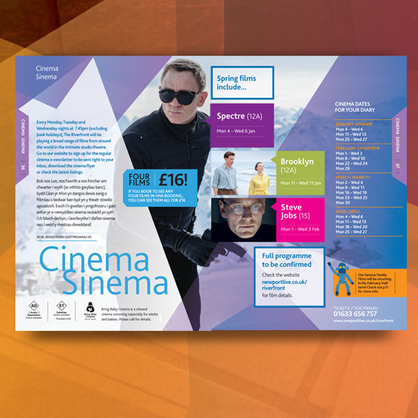
One of the design features I most like on this programme is the use of vertical text. I also like the fact that it has quite an understated colour scheme and that most of the colour comes from the photos. I think this essentially makes reading/understanding the programme easier for the audience. The design feature I like most on this brochure and that I could use in my own work is the overlapping images. They are also relatively low in opacity and I think using this combination in my own work would allow the audience to be given a lot of information about the film without being overwhelmed by content. Planning and sketching
1) Create a spider diagram or bullet point list of all the things your target audience might be interested in. How can you use this information to create a main feature about your film that will appeal to your target audience?
2) Produce an A5 sketch of your front cover including the key conventions and design tricks you have studied in existing programmes and then planned in planning task 1 above.
3) Produce an A4 sketch of your double-page spread contents page. In terms of the text for your contents page, you will need to find out the names of the films of other groups in your class. The other films in the class will make up the rest of your contents page.
4) Create a spider diagram or bullet point list of ideas for your double-page spreadfeature. Write a list of potential headlines and sub-headings for the article you choose to go with.
5) Produce an A4 landscape sketch of your double page spread design now you have chosen the subject matter.
Photoshoot
1) Which of your main characters will appear on the front cover of your programme? Just the protagonist, Natalie. 2) What image or images do you need for the contents page? A larger image from my film of the two main characters (Natalie and Moses) and possibly smaller images from the other productions. 3) What image or images will you use for the double-page spread? Several images from my production's photoshoot - one of all four characters, one of the two main characters and two of the protagonist on her own. 4) Write a shot list for the photoshoot. Make sure you plan a variety of camera shots you will look to capture - medium shots, close-ups etc. -Medium shot - Sophie and Daniel with backs to each other -Medium long shot - all four main characters standing next to each other. -Medium-close up shots - Sophie's face + various facial expressions. -Medium-close ups - remaining three actors with eyes open/shut. 5) What costume, props or make-up will you require for the photoshoot? No props are needed but the costume will need to be quite casual clothing accompanied by very subtle makeup, given that the the protagonist starts the film coming out of a modern-day hospital after enduring a traffic accident and multiple days in a coma.